"What are the latest services of your organization?"
Since COVID, email marketing has surged as people have moved to online purchases and, consequently, reading marketing offers online. Thus our most recent services involve designing and setting up emails using various mail service platforms. Over the past few years, we've had several clients specifically contracting us for EDM.
In the beginning, our focus was solely on design. We learned that there's no need to reinvent the wheel when designing each letter as a unique piece. The key 🔑 is to develop a strategic map for each email or campaign and create templates for recurring emails.
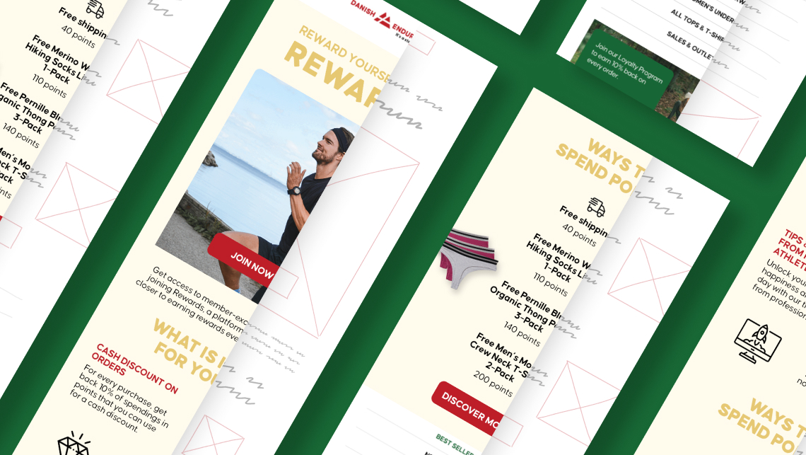
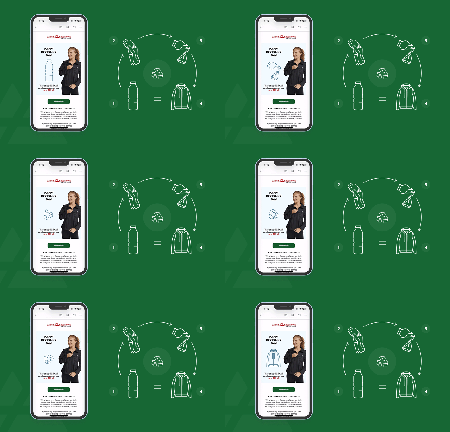
Here's an example with a real customer, Danish Endurance, a Danish lifestyle brand producing sports and recreation clothing. We had a contract with them for about two years, designing two newsletters per week and closely collaborating with their marketing team. Their marketing relies on sales, making it recurring, featuring events like Father's Day sale, Top Running Gear sale, Free Shipping, and other incentives to drive buyers to their website.

Initially, we aligned newsletters, websites, and social media assets. After approving the newsletter design, I worked on web and mobile banners and social media posts. We developed a consistent structure for each email, including:
header
main banner with the offer
bold CTA
subsequent sections
a footer with the company's information, mirroring the website.
We agreed on color combos and applications for each campaign, such as black for Black Friday sale and the company's red, St. Valentine's red and white, or light yellow and blue for Easter sale.

Once these were established and used, we moved on to classify email campaigns. For example, Black Friday sale had three newsletters: teaser, the sale itself, and a prolonged sale. All three designs had the same banner style - black background with bold red lettering. We applied the same approach to other recurring sales. Additionally, we designed more general emails with mix-and-match sections for versatile use.
Over 2 years, we established "do's" and "don'ts" rules. At the end, the client was satisfied, concluding the contract and gaining the ability to use all assets independently. We were delighted with the fruitful partnership. They utilized Klaviyo as their marketing software, and we learned about its setup. Klaviyo is effective for using exported images and gifs (up to 5MB), with some limitations but good rendering capabilities.

Another client, Returnable, used Mailchimp. We had access to their account and designed and set up client journey emails, like "Welcome" emails, "Forgot your password", and other recurring letters. Despite being a good service, a downside is the inability to edit copy with a free subscription, affecting the beauty of the designed email. However, overall, it is suitable for small to mid-sized firms seeking professional-looking EDM.
The third software used was Constant Contact, with which I faced the most issues. Due to an NDA, I can't provide visuals and names. Despite the paid version offering custom fonts and styles, it lacked flexibility in the design-builder itself. Creating editable templates proved challenging, resulting in a primitive appearance. When viewed on mobile, images are rendered poorly, creating a mismatched and misaligned look. After designing two newsletters, the client realized the issues and put our contract on hold.
In conclusion, our journey through various email service platforms highlights the need for tailored approaches based on client requirements and the desired visual outcome. Each platform presents unique features and limitations, shaping our adaptive strategies to deliver effective and visually appealing email campaigns.
See 2 case studies in our portfolio: Weekly newsletters and Social Media Assets.


